In this technology age, church websites are a very important way to attract visitors and connect with members online. A well organized website properly introduces your church to people searching online and also the world at large.
Websites are usually the first contact for visitors and helps them form a first impression about who you are, what you represent and whether or not you are what they are looking for. Therefore, we need to put more effort in website design, structuring, content, and presentation.

Below are some common mistakes made on church websites and how you can avoid/correct them to ensure your website is of a global standard.
FOCUSING ON MEMBERS ONLY
The main focus of your website should be to attract potential visitors. The design and information should be directed towards their interests. This does not mean your members should be neglected but it is important to find a balance between focusing on members and your potential visitors. Answer questions such as Where is the church located? What are the service times? How do I become actively involved? Where is the nearest cell to me? etc.
Also, you need to prioritize information that goes on the website so as not to overwhelm your visitors with too much information and avoid providing too little information.
POOR IMAGE QUALITY AND BAD TYPOGRAPHY
Presentation is a vital part of a website. Images on your website should adequately represent what potential visitors should expect when they come to church. Poor quality images may create the impression that your church is outdated and that is a dealbreaker for your visitors.
Typography encompasses the font choice, spelling of words, letter spacing, word spacing, etc. It is important that the chosen font is legible, letters and words are properly spaced so people can read well. Spelling errors need to be avoided by constantly reviewing the website content and conducting spelling checks to ensure top quality information uploaded on your website. There are tools available to help you conduct spelling checks and correct errors. One of those is Grammarly, you can check it out here.
NOT RESPONSIVE/MOBILE-FRIENDLY
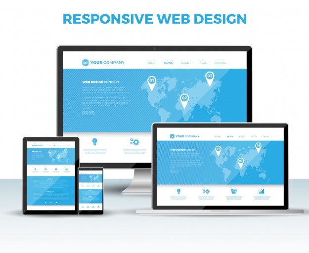
A responsive website is a website that adapts to any device screen size and is easy to navigate on these devices. If your website is not responsive then the design and structure will only be correctly organized on a computer or laptop screen size. Most of your website visitors will most likely be browsing on their mobile phones or tablets so you need to ensure the responsiveness attribute is included in your website design.

POOR WEBSITE DESIGN
When people visit your website, it takes them just a few seconds to decide whether or not they want to continue browsing. The design gives them a first impression of your church. A well designed site shows that your church is up to date, professional and clearly credible. The colours, theme, images and text especially on the Home page, all play important roles. Ensure you have a simple yet exceptional design to attract your potential visitors and keep them interested.
SLOW WEBSITE LOAD TIME
This is the most discouraging attribute a website can have generally. Slow load time can be frustrating and a lot of people do not have the patience to wait for your website to load properly. It is important that your website loads speedily on any device in order not to discourage potentials visitors from navigating and getting the information they need.
In conclusion, Church websites go a long way in shaping a person’s perception of the church. If you are looking to develop a church website then this article is for you. If you already have a website then you should consider a review to check for the above mistakes and work towards correcting them.
At ChurchPlus, we design websites for churches taking into consideration all the important factors that contribute to successfully reaching out and connecting with your potential visitors and members. To read more on how we can help you, visit our website.


